


[{<style>.four-col-static .block-copy {padding: 0;}.four-col-static p {margin: 0;}.four-col-static a {position: relative;}.four-col-static a span {text-transform: uppercase;}
@media (width >= 600px) {.four-col-static .desktop-img {display: flex;}}
.brands span.caption {text-decoration: underline;}
.brands {background: #ffeee8;padding: 2% 0;}
.content-block.brands .block-img {justify-content: center;}
.brands p {margin: 0 auto;flex: 0 0 50%;text-align: center;}
.brands img {width: 40%;margin: 0 auto;}
.brands .mobile-img.block-img {display: flex;flex-wrap: wrap;}
.brands .desktop-img.block-img {display: none;}
@media (min-width:640px) {.brands p {flex: 0 0 20%;}
.brands .desktop-img.block-img {display: flex;flex-wrap: wrap;}
.brands .mobile-img.block-img {display: none;}}
</style>}]
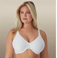
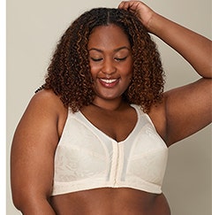
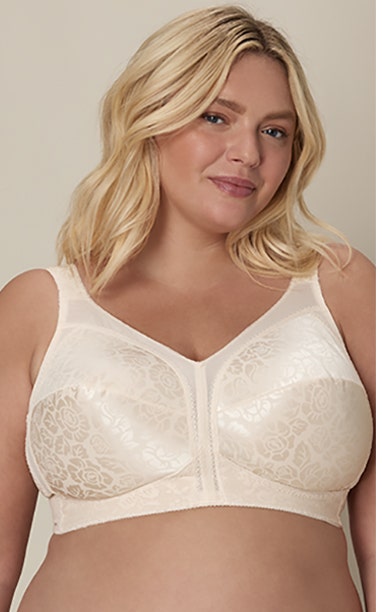
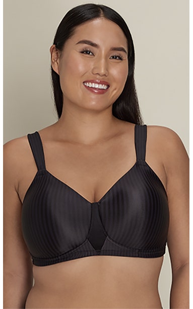
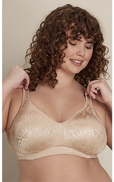
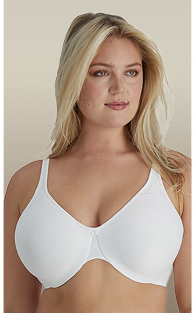
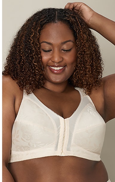
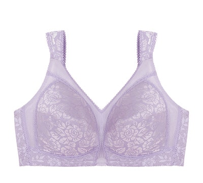
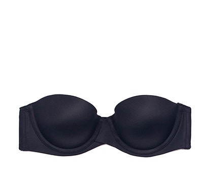
BRAS Comfortable support for your curves
FROM $17.99
[{<style>.five-col-static .block-copy {padding: 0;}.five-col-static p {margin: 0;}.five-col-static a {position: relative;}.five-col-static a span {text-transform: uppercase;}
@media (width >= 600px) {.five-col-static .desktop-img {display: flex;}}
.bras span.caption {text-decoration: underline;}
.bras {padding: 2% 0;}.content-block.bras .block-img {justify-content: center;}
.bras p {margin: 0 auto;flex: 0 0 50%;text-align: center;}
.bras h2 { font-weight: 400; text-align: center; padding: 2%; font-family: montserrat; font-size: 250%;}
.bras h2 em { display: block; padding: 1rem; font-style: normal; font-size: 75%; font-weight: 200;}
.bras h4 { border: solid 2px #000; font-size: 300%; font-weight: 200; font-family: 'montserrat';
}
.bras h4 strong { display: block; margin: 2%; font-weight: 900;}
.bras {padding: 0; position: relative;}
.bras img {margin: 0 auto;}
.mobile-img.block-img {display: flex;flex-wrap: wrap;}
@media (min-width:640px) {
.bras h2 {width:50%;}
.bras h4 { width: 32%; text-align: center; margin: 1% 0% 3%; font-size: 300%; font-weight: 200; font-family: 'montserrat'; border: 2px solid; padding: 1%; position: absolute; top: 2%; left: 50%; }
.bras h4 em {font-style: normal;}
.bras h4 strong {font-weight: 900; display: inline;}
.bras p {flex: 0 0 20%;}
.bras .desktop-img.block-img {display: flex;flex-wrap: wrap;}
.bras .mobile-img.block-img {display: none;}
}
</style>}]
SHOP BRAS
BY SILHOUETTE
[{<style>.eight-col-static .block-copy {padding: 0;}.eight-col-static p {margin: 0;}.eight-col-static a {position: relative;}.eight-col-static a span {text-transform: uppercase;}
@media (width >= 600px) {.eight-col-static .desktop-img {display: flex;}}
.bsilhouette span.caption {text-decoration: underline;}
.bsilhouette {padding: 2% 0;}.content-block.bsilhouette .block-img {justify-content: center;}
.bsilhouette p {margin: ~~0;~~text-align: center;flex: 0 0 50%;}
.bsilhouette h2 {font-weight: 200;text-align: center;font-family: montserrat;}
.bsilhouette h2 strong {font-weight: 900;}
.bsilhouette img {margin: 0 auto;}
.content-block .mobile-img:empty ~ .desktop-img {display: flex;flex-wrap: wrap;}
.usilhouette a {
z-index: 10;
}
@media (min-width:640px) {
.bsilhouette h2 {font-weight: 200;text-align: center;font-family: montserrat;
font-size: 300%;}
.bsilhouette p {flex: 0 0 16.5%;}
.bsilhouette .desktop-img.block-img {display: flex;flex-wrap: wrap;}
.bsilhouette .mobile-img.block-img {display: none;}
}</style>}]
UNDERWEAR Mix & Match
BUY 3+ GET20%
UP TO 40%
UP TO 35%
[{<style>.three-col-static .block-copy {padding: 0;}.three-col-static p {margin: 0;}.three-col-static a {position: relative;}.three-col-static a span {text-transform: uppercase;}
@media (width >= 600px) {.three-col-static .desktop-img {display: flex;}}
.cats span.button.tertiary {
padding: 0 29px;
}
.cats span.caption {text-decoration: underline;}
.cats .desktop-img.block-img {position: relative;}
.cats {padding: 2% 0;}
.content-block.cats .block-img {justify-content: center;}
.three-col-static a {position: relative;}
.three-col-static a span {text-transform: uppercase;white-space: nowrap;}
.three-col-static p {margin: 0;POSITION: RELATIVE;}
.cats em {position: absolute;top: 2%;color: #FFF;font-family: montserrat;
font-style: normal;font-size: 233%;width: 100%;margin: 0 auto;left: 0;font-weight: 600;}
.cats del {position: absolute;top: 10%;color: #fff;font-weight: 100;font-family: 'montserrat';text-decoration: none;WIDTH: 100%;LEFT: 0;FONT-SIZE: 250%;}
.cats strong {font-weight: 900;padding: 0 0 0 2%;}
.cats .desktop-img p:nth-child(1) span.caption {
position: absolute;
Margin-top: -33%;
Margin-left: -17%;
z-index: 10;
}
.cats .desktop-img p:nth-child(3) span.caption {
position: absolute;
Margin-top: -33%;
Margin-left: -17%;
z-index: 10;
}
.cats .desktop-img p:nth-child(2) span.caption {
position: absolute;
Margin-top: -226%;
margin-left: 34%;
z-index: 10;
}
.cats .desktop-img p:nth-child(2) a:nth-child(2) {
bottom: 32%;
position: absolute;
left: 57px;
}
.cats .desktop-img p:nth-child(2) a:nth-child(3) {position: absolute;bottom: 11%;right: 35px;}
.cats .desktop-img p:nth-child(1) span.caption {
position: absolute;
Margin-top: -33%;
Margin-left: -17%;
z-index: 10;
}
.cats p {margin: 0 auto;flex: 0 0 100%;text-align: center;}
.cats img {margin: 0 0 2%;}
.mobile-img.block-img {display: flex;flex-wrap: wrap;}
@media (min-width:640px) {
.cats p {flex: 0 0 33%;}
.cats .desktop-img.block-img {display: flex;flex-wrap: wrap;}
.cats .mobile-img.block-img {display: none;}
.cats .desktop-img p:nth-child(2) span.caption {
position: absolute;
Margin-top: -226%;
margin-left: 34%;
z-index: 10;}
}
</style>}]
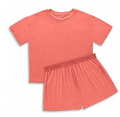
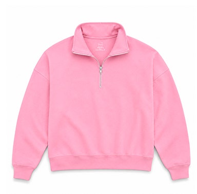
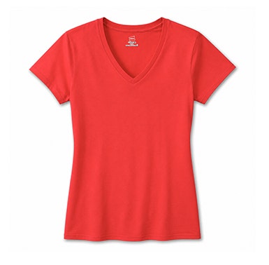
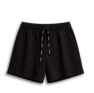
EVERYDAY ESSENTIALS
Active days to calm evenings, comfort starts here.
[{<style>.five-col-static .block-copy {padding: 0;}.five-col-static p {margin: 0;}.five-col-static a {position: relative;}.five-col-static a span {text-transform: uppercase;}
@media (width >= 600px) {.five-col-static .desktop-img {display: flex;}}
.everyday span.caption {text-decoration: underline;}
.everyday {padding: 2% 0;}
.content-block.everyday .block-img {justify-content: center;}
.everyday p {width:100%;~~;~~text-align: center;}
.five-col-static a {
position: relative;
width: 100%;
}
.everydayes h2 {font-family: ‘montserrat’;font-weight: 500;font-size: 300%;
margin: 6%;}
.everyday h2 strong {font-weight: 900;}
.everydayes h2 {font-family: 'montserrat';font-weight: 500;font-size: 300%;
margin: 6%;}
.everydayes h3 {font-weight: 300;font-family: 'montserrat';margin: 0 7%;}
.everyday img {margin: 0 auto;}
.content-block .mobile-img:empty ~ .desktop-img {display: flex;flex-wrap: wrap;}
@media (min-width:640px) {
.everydayes h2 {margin: 2%;}
.everyday p {flex: 0 0 20%;}
.everyday .desktop-img.block-img {display: flex;flex-wrap: wrap;}
.everyday .mobile-img.block-img {display: none;}}
</style>}]
CLEARANCE
UP TO
60% OFF
[{<style>
.clearance {padding: 10%;background: #000;}
.clearance h2 {color: #fff;font-weight: 900;font-family: 'montserrat'}
.clearance h3 {color: #fff;font-family: 'montserrat';font-weight: 200;font-size: 194%;}
.clearance h4 {color: #a92929;font-family: 'montserrat';font-size: 350%;}
.clearance .desktop-img.block-img {
display: block !important;
}
@media (min-width:640px) {
.clearance {padding: 2%;}
.clearance h2 {font-size: 260%;display: inline;}
.clearance h3 {font-size: 266%;display: inline;}
}
</style>}]
h3#makeyourselfcomfortable { margin: 0;
font-weight: var(--fw-black); font-size: clamp(2rem, calc(2rem + 1vw), 4rem);}
h3#makeyourselfcomfortable + p {
font-weight: var(--fw-medium);
font-size: clamp(1.2rem, calc(1.2rem + 1vw), 1.8rem);
}
banner-container.banner-type-promo {
--promo-banner-background: #B16550;
}